










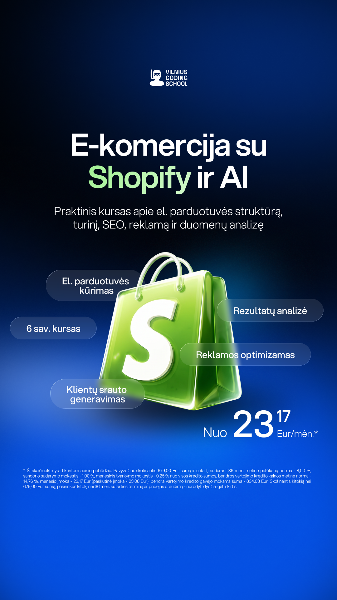
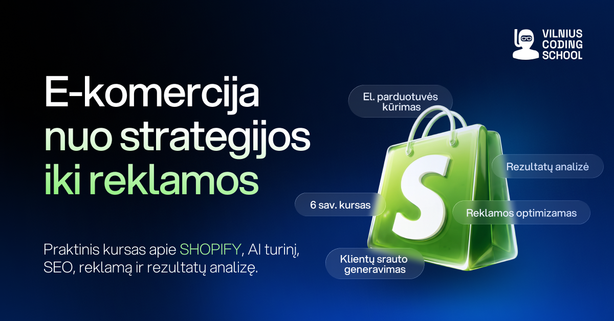

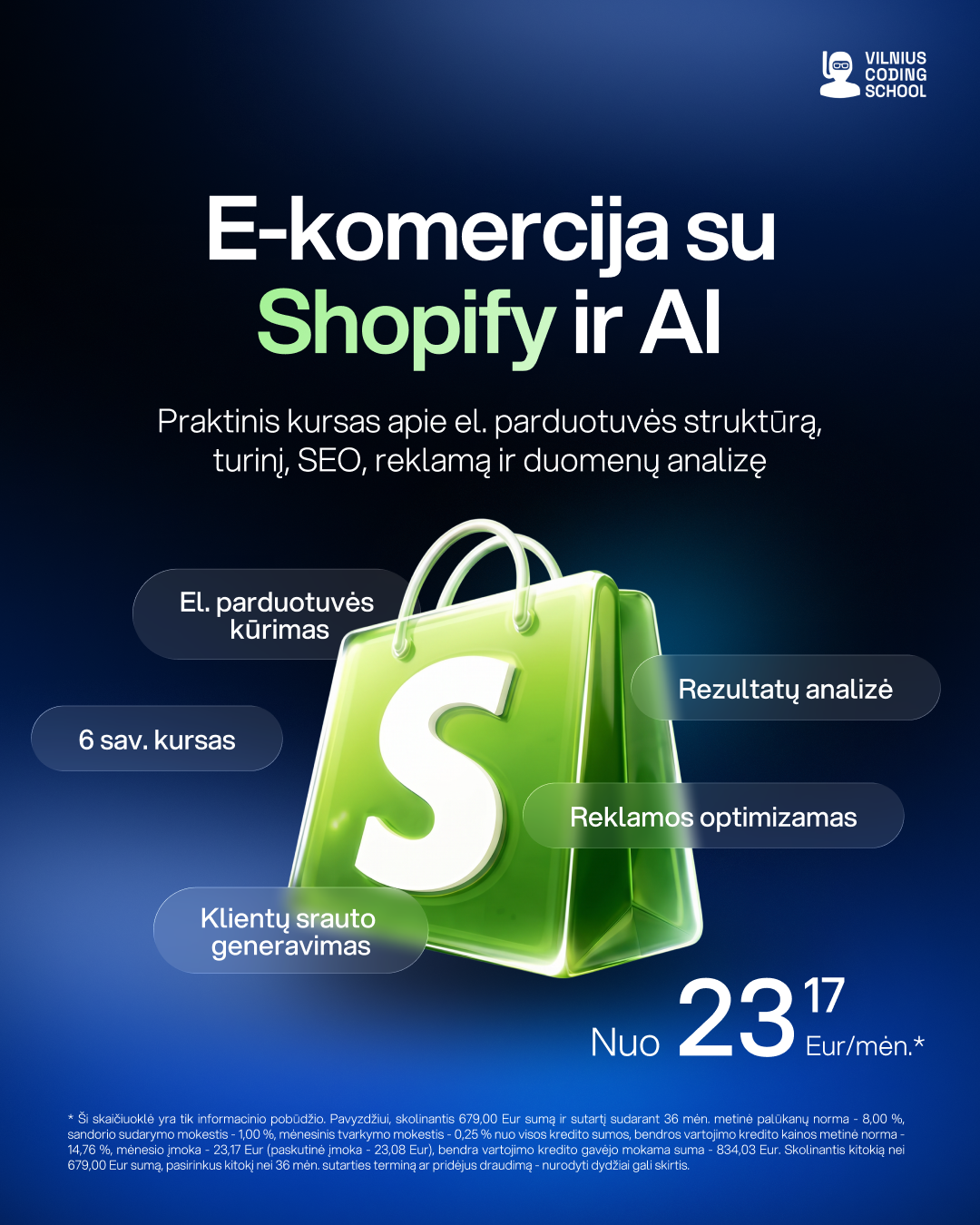
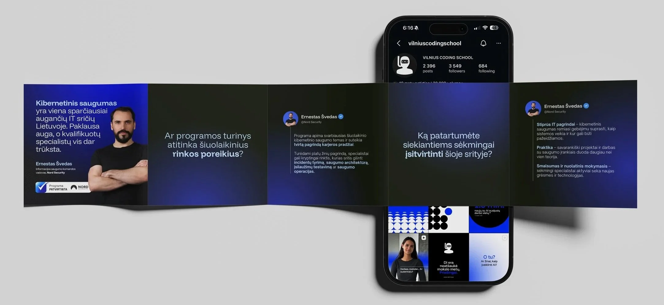


Vilnius Coding School, nine months of campaigns in one voice.
- Client
- Vilnius Coding School
- Role
- Sole in-house designer: campaigns, social, email, landing pages in code
- Year
- 2025 to 2026
- Where
- In-house, Vilnius Coding School
The brief
One of Lithuania's largest tech career schools, with a marketing calendar that never stops: a new programme, a new price, a new deadline every week, and ads that looked like everyone else's.
What I did
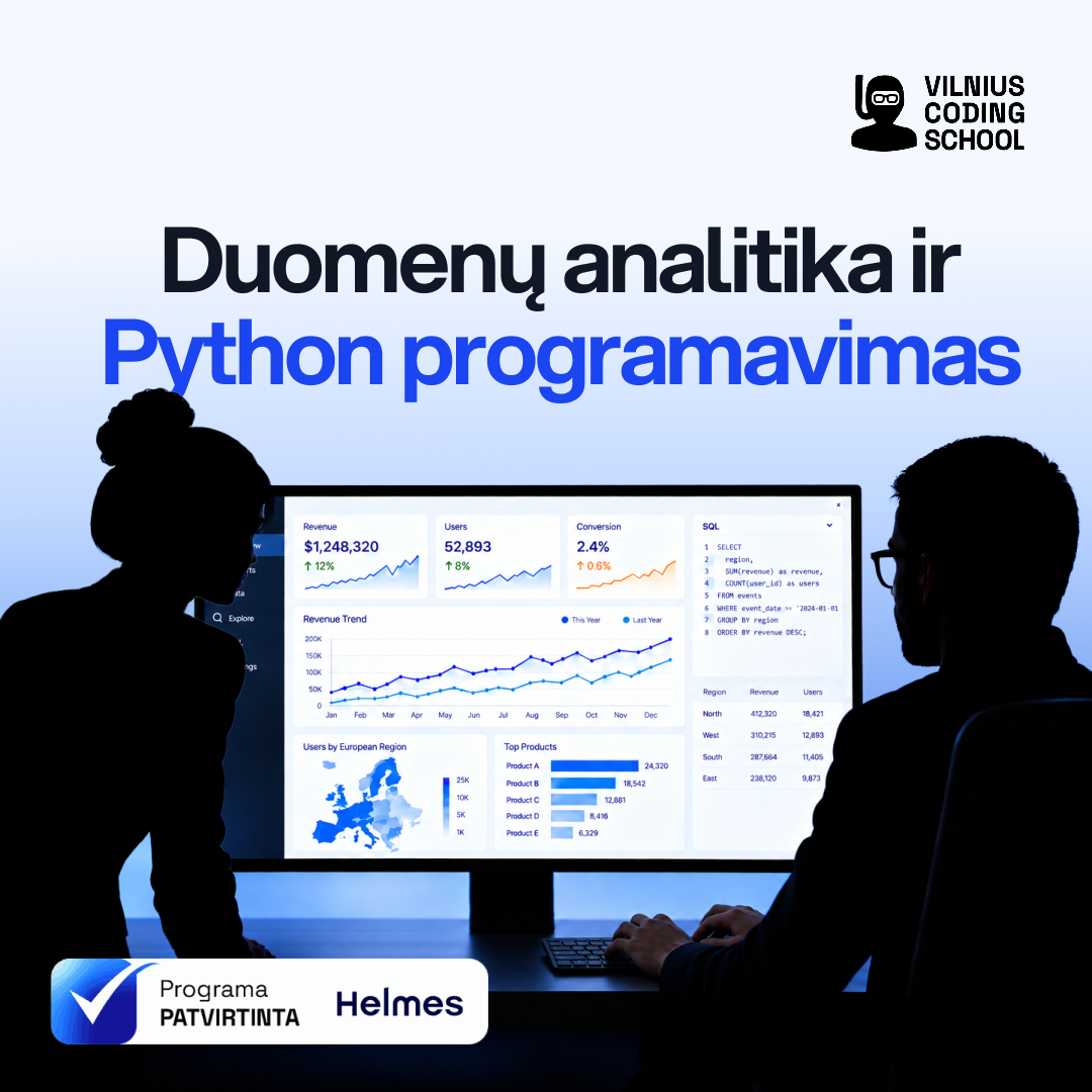
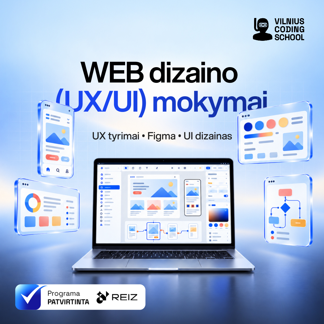
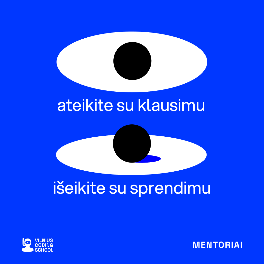
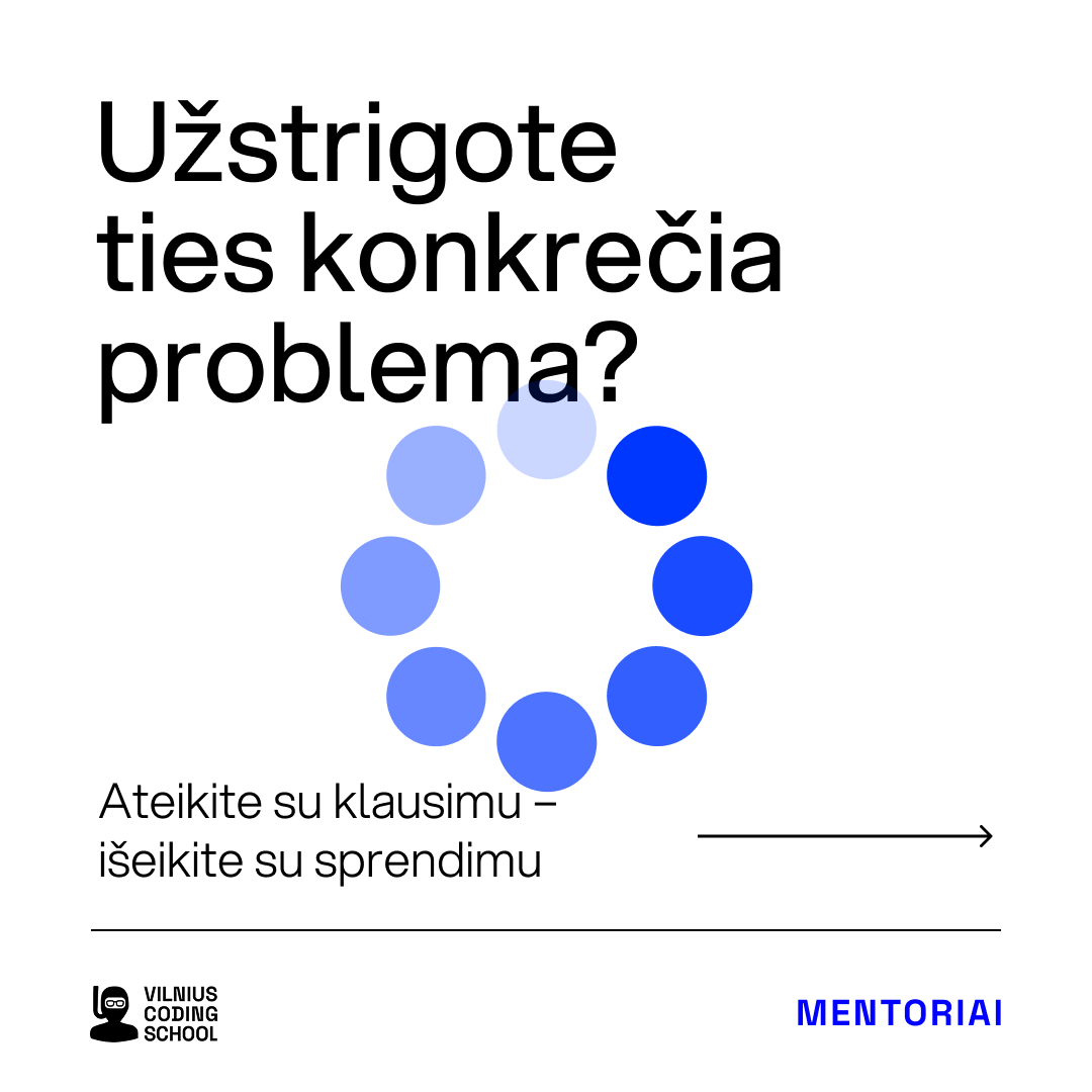
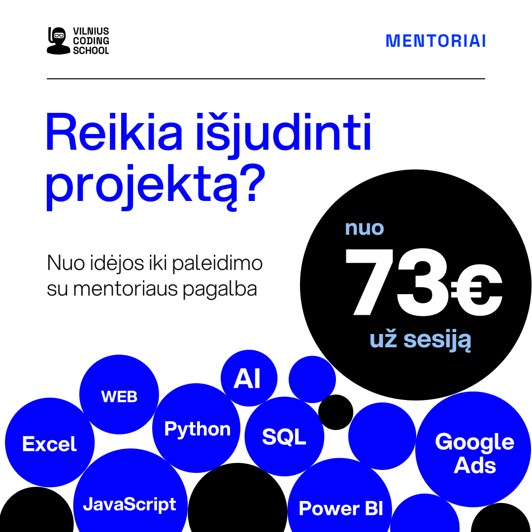
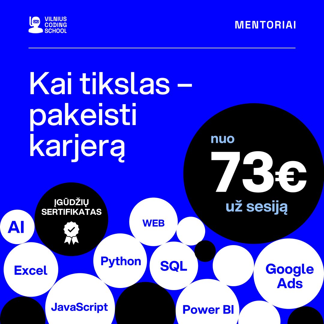
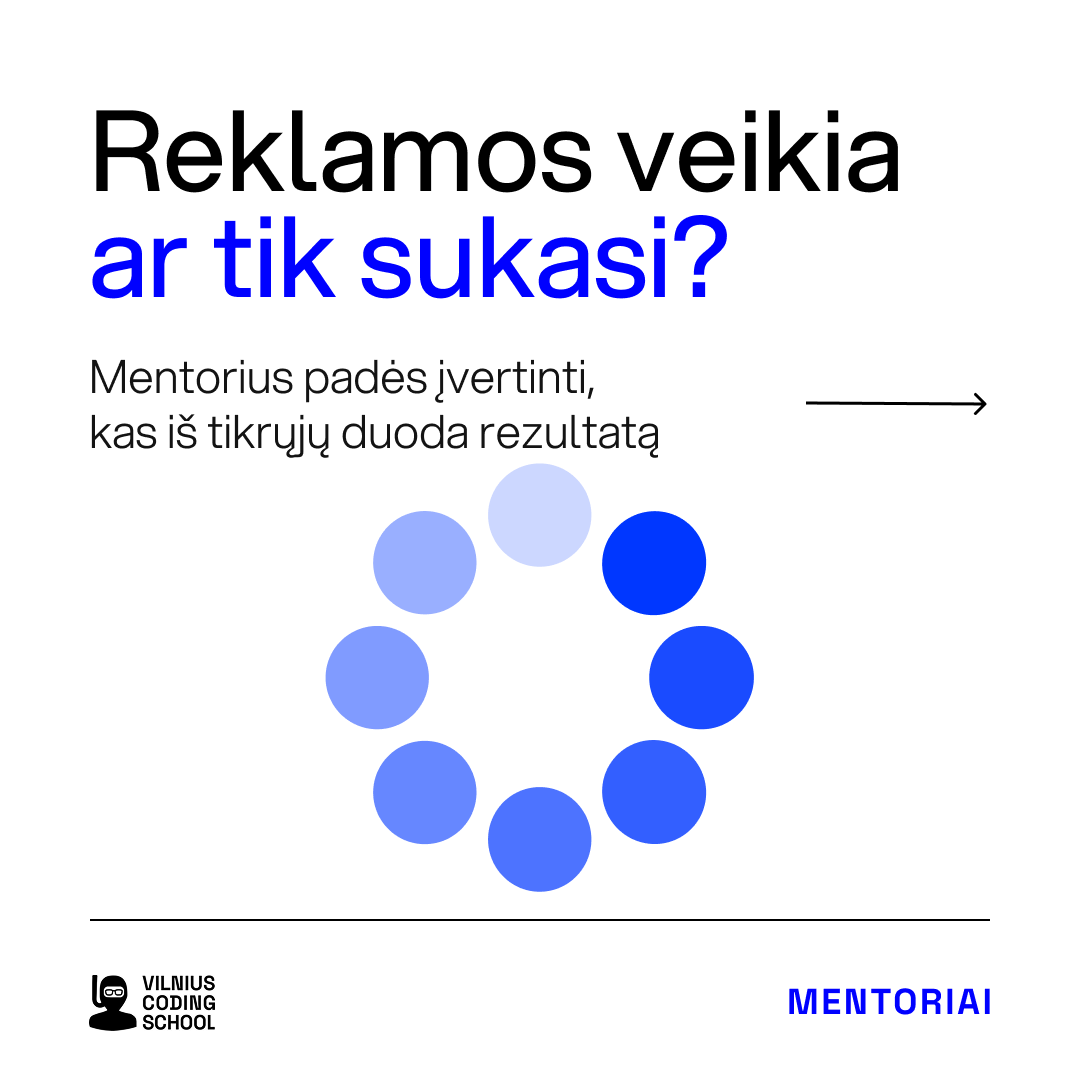
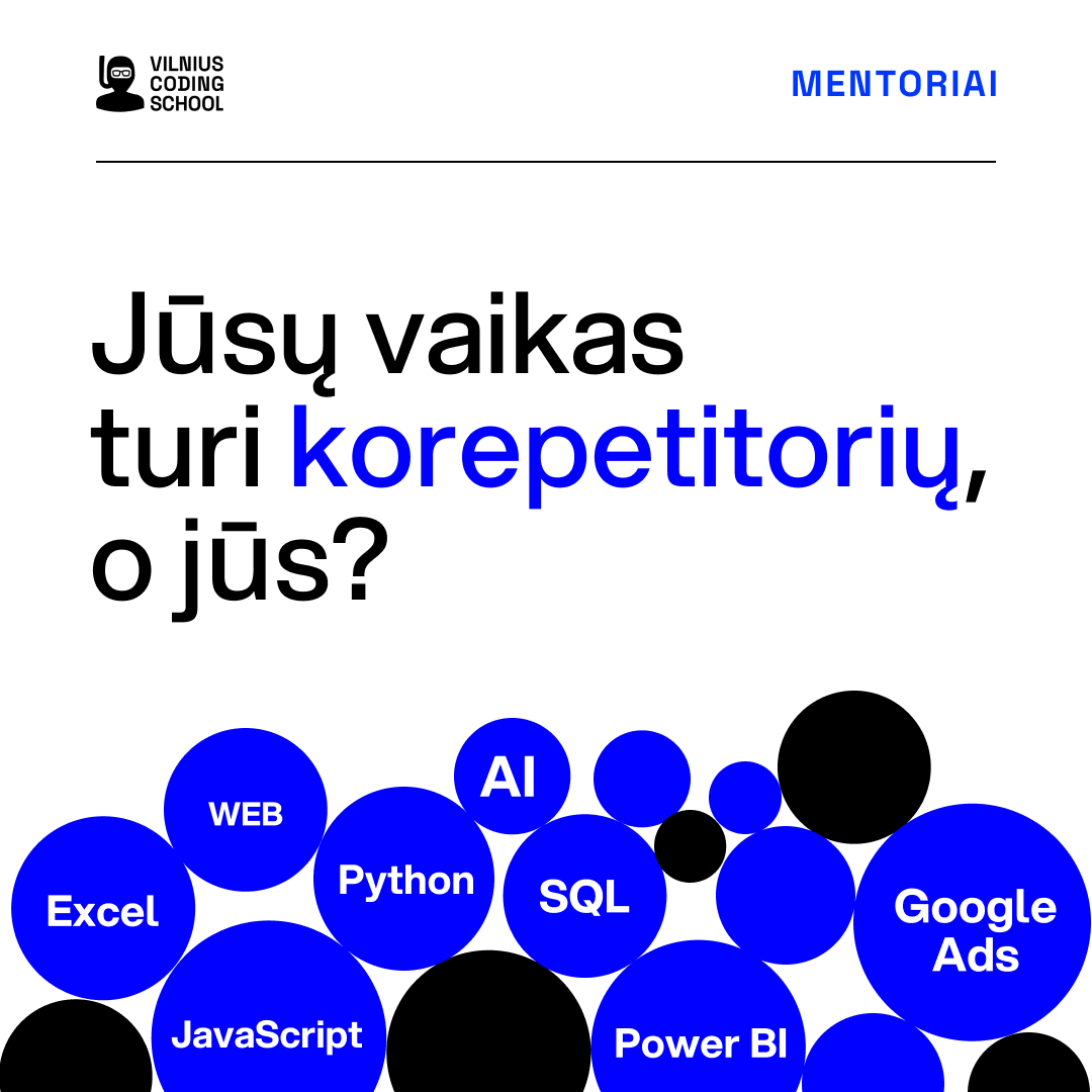
Every banner, post, email, course thumbnail and landing page for nine months, about a thousand files. From May I changed what a tile is allowed to say: one idea, the question the reader already has, one blue, no starbursts. No rebrand, no new logo, and every campaign still shipped on time.
What it shows
What a monthly design partner looks like in practice: volume without drift, and a change of voice made from inside the queue rather than by a rebrand. The full case study is on this page.
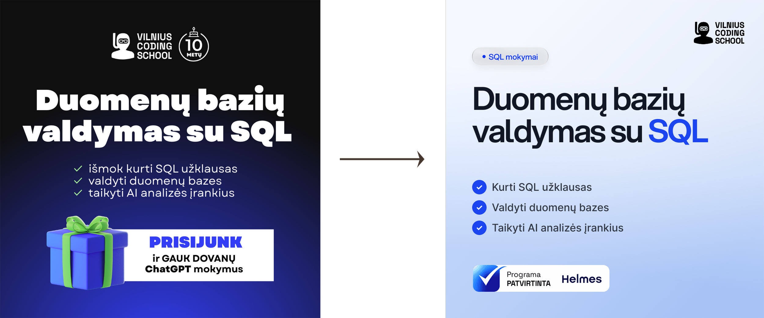
The same programmes, the same budget, a calmer and more specific voice.
From late spring I changed the rules for every asset going out, and kept them simply by being the person who made all of them. No new logo, no new palette, no brandbook required. The change is in what a tile is allowed to say and how much it is allowed to shout.
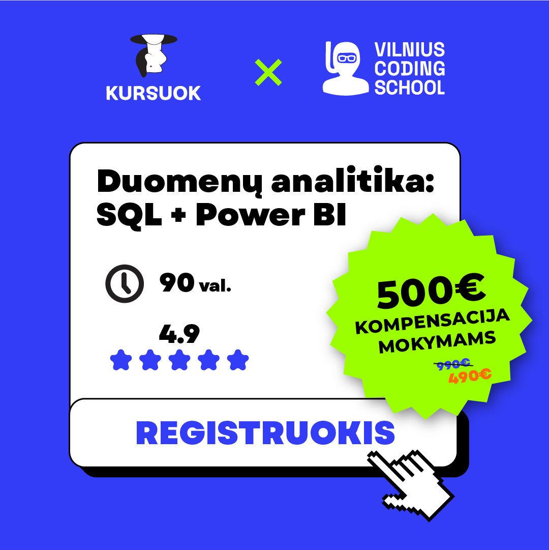
Before
- MessageDiscount, deadline, seats left
- HeadlineA claim or an order
- VisualStickers, starbursts, 3D gifts, stock reactions
- ColourBlue, green, black and yellow competing
- TypeWhatever fitted the tile
- DensityThree to five elements asking for attention
After
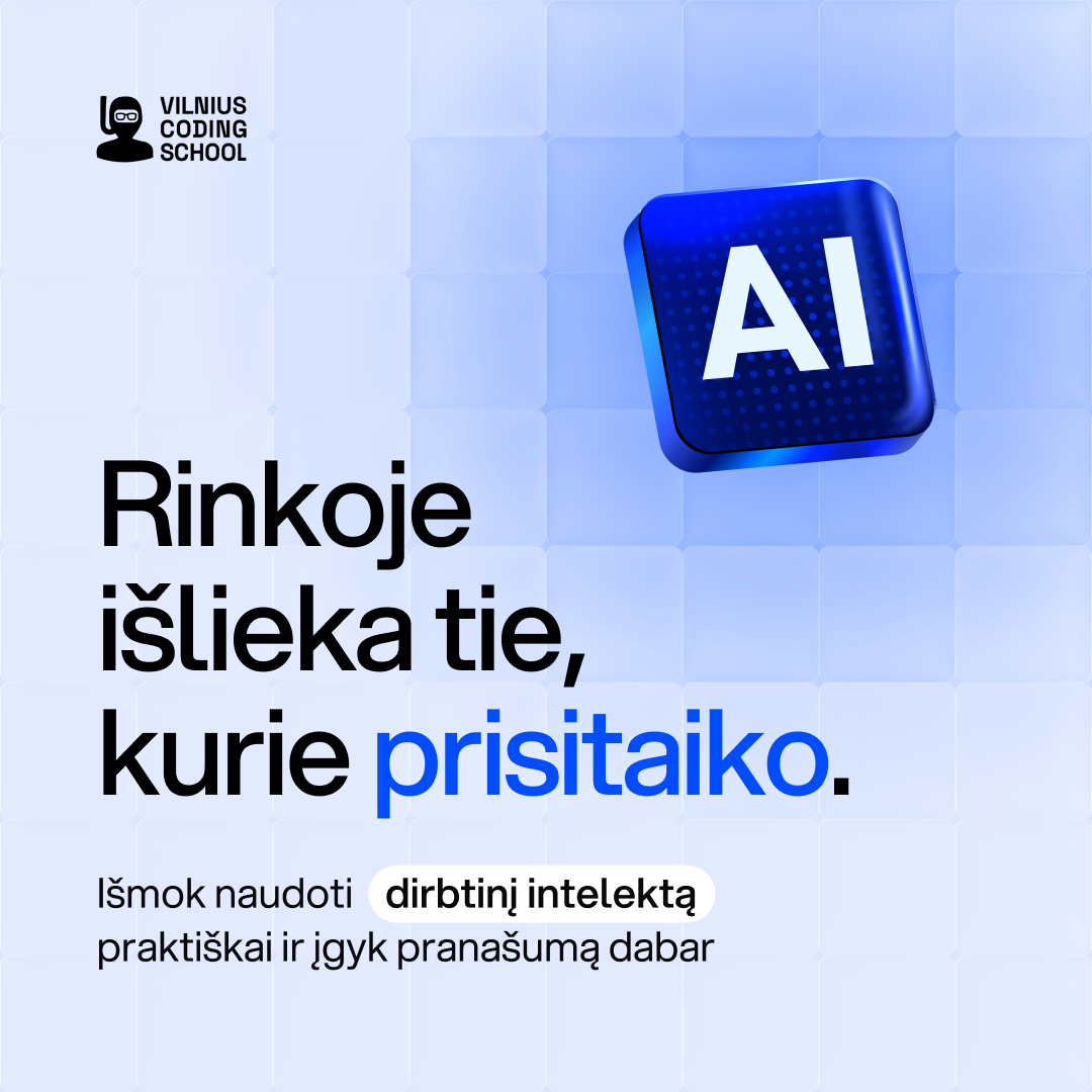
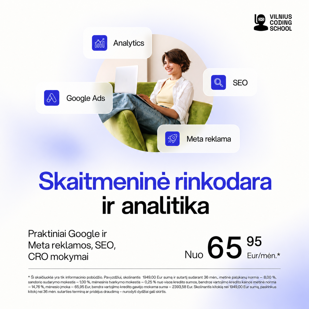
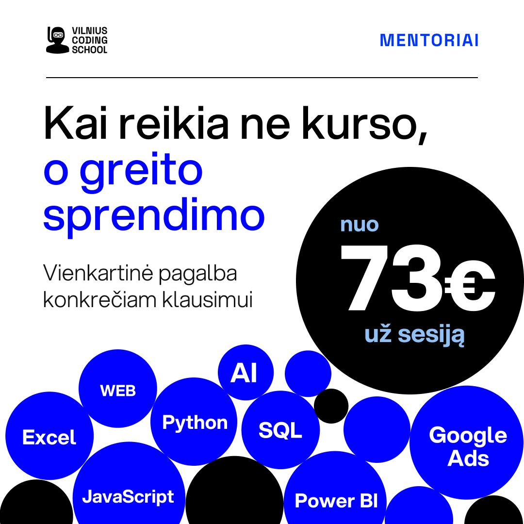
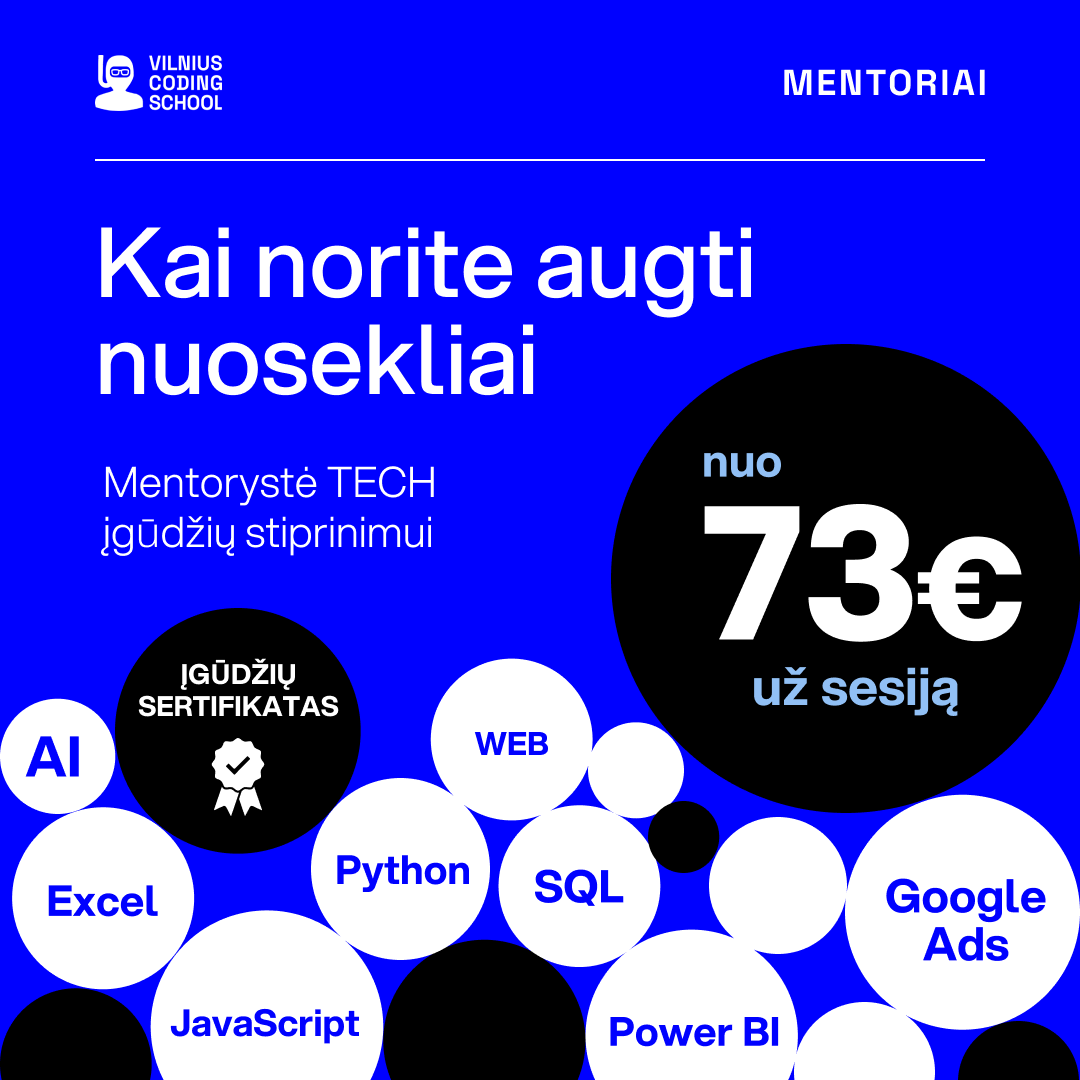
- MessageOne idea per tile. Price shown as a fact, not a deal
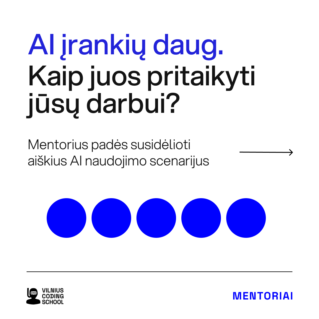
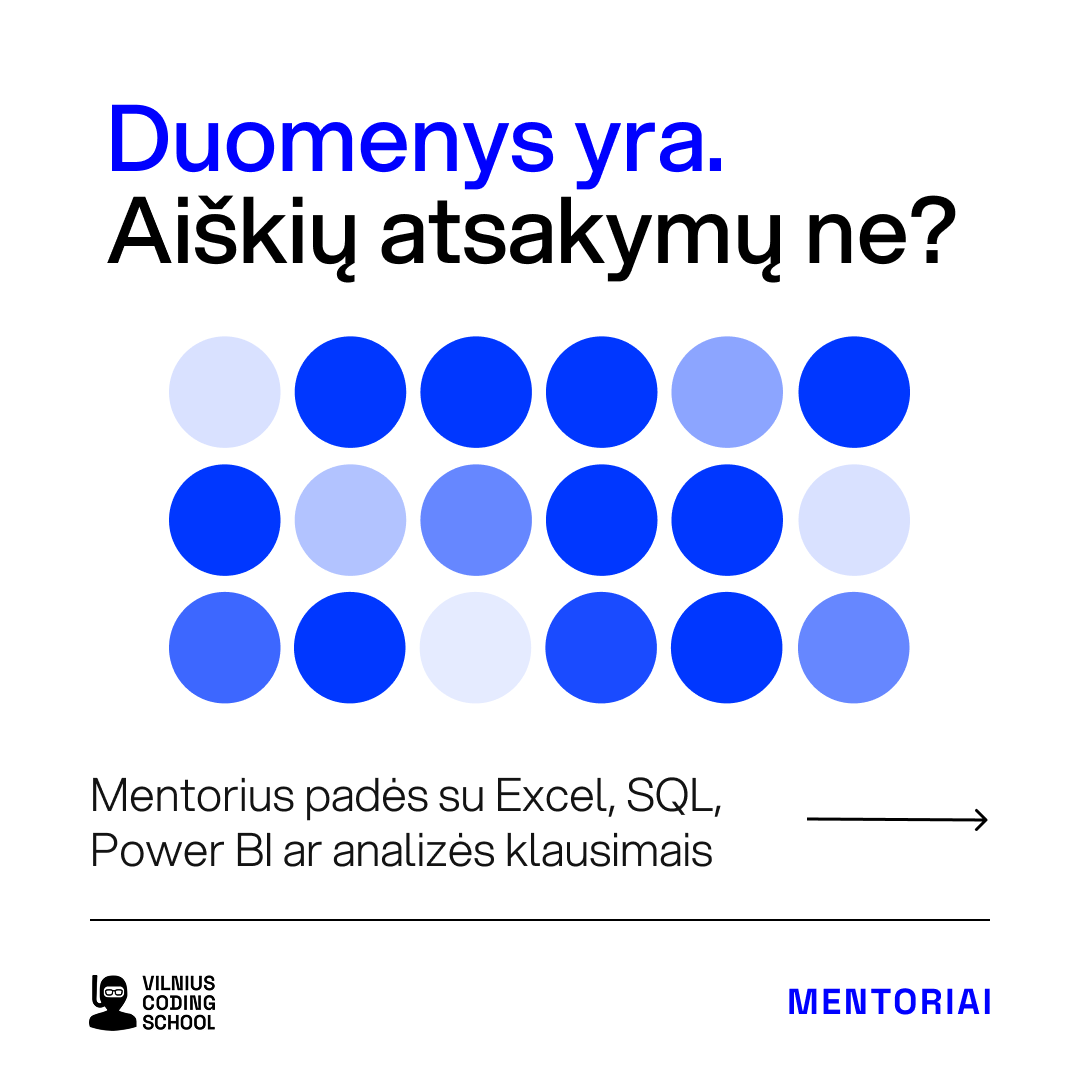
- HeadlineThe question the reader is already asking
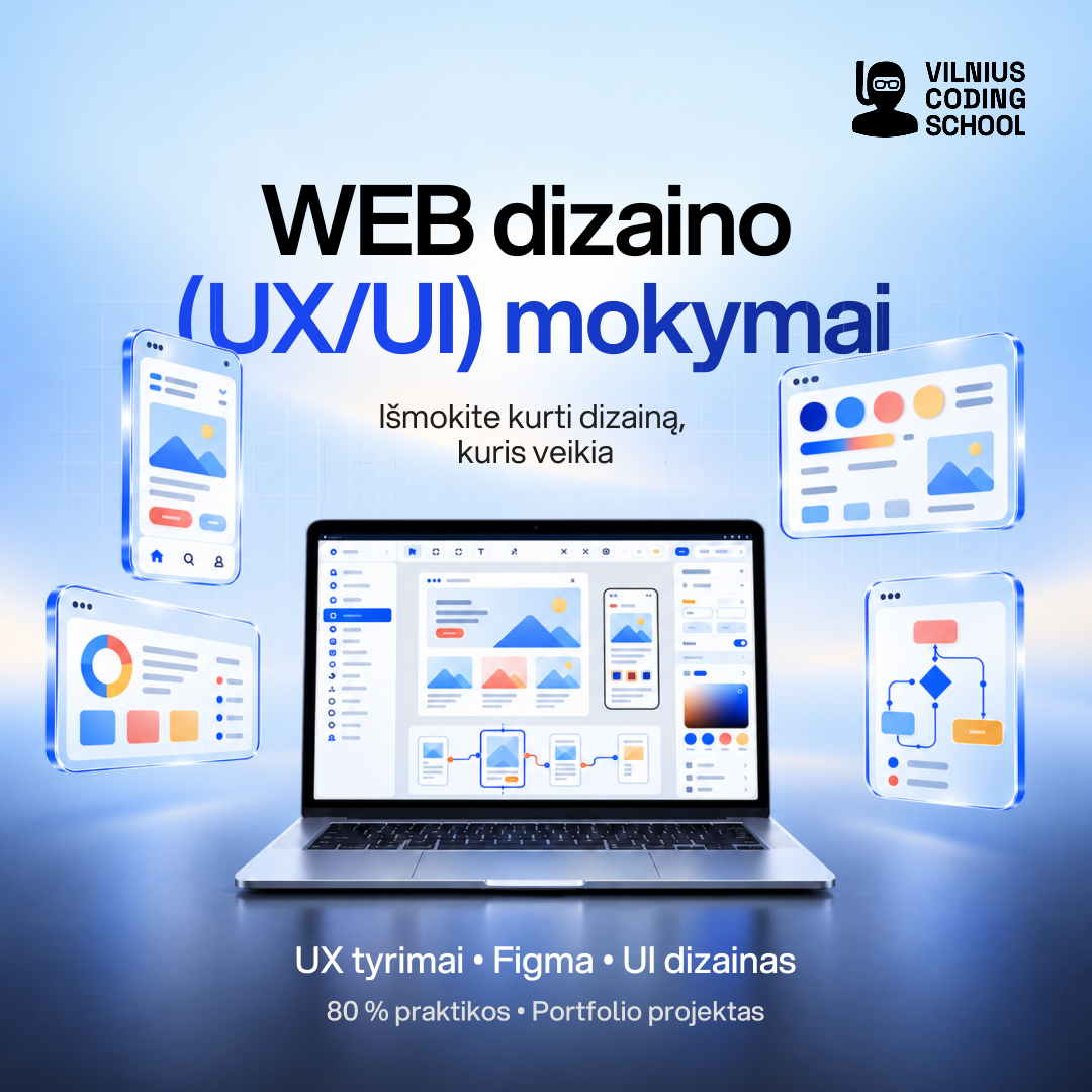
- VisualOne object, one interface fragment or one person at rest
- ColourOne blue on white or on itself; green demoted to a small pill
- TypeOne family, one scale, blue for the operative word
- DensityHeadline, support line, one row of chips
Ten to fifteen finished assets a week, for nine months.
A typical campaign brief arrives on Monday as a programme name, a date and a price. By Wednesday it is a message with three headline variants, each exported in four placements (square, portrait, story, landscape), plus a landing-page banner and, when the budget allows, an animated version. The counts below come from my project archive, one folder per campaign.
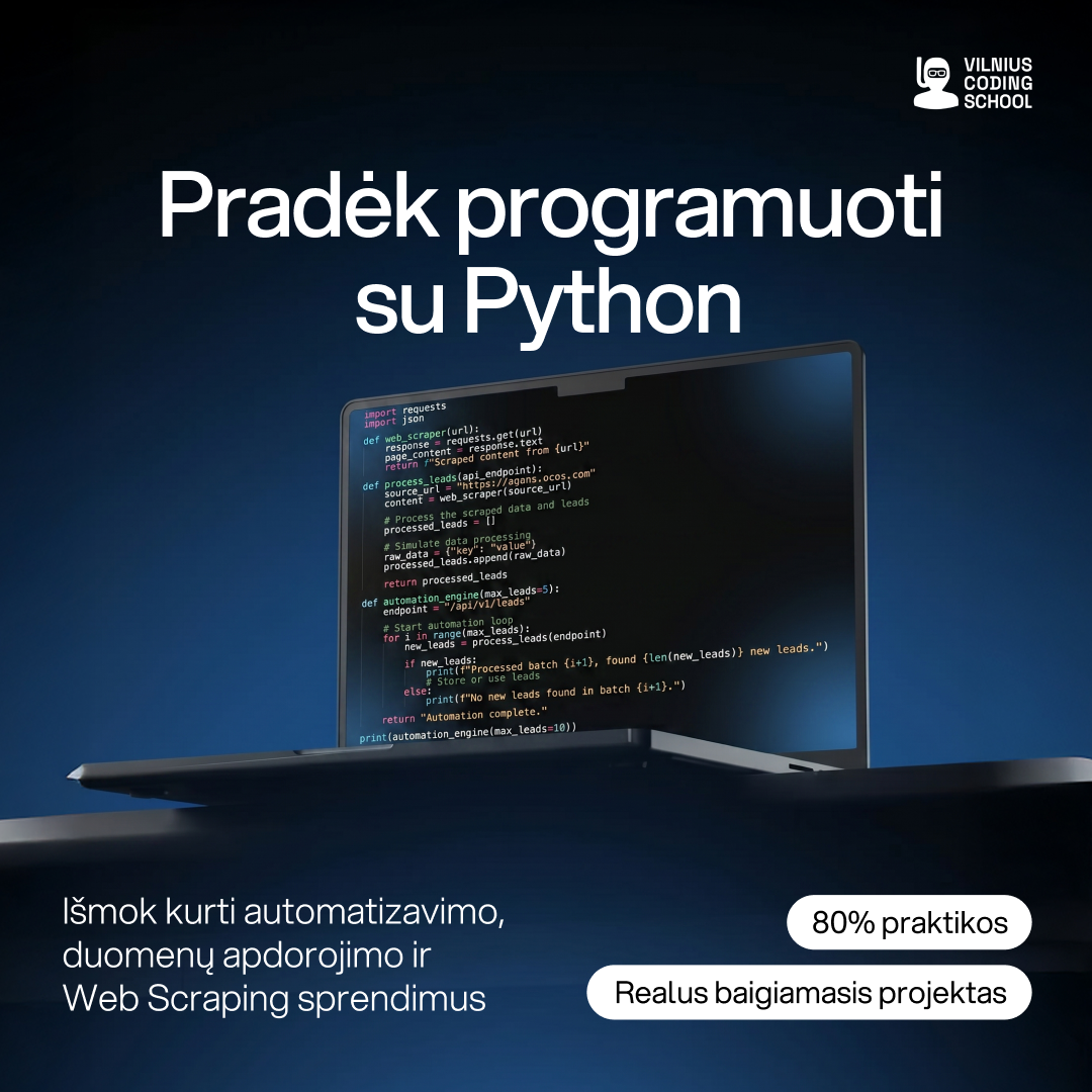
The same rules carry into every size the school uses: stories, animated banners, Performance Max and YouTube placements, partner carousels, course thumbnails, emails, and the small formats that make a brand feel finished.
- Paid-social banner sets61
- Organic posts and carousels38 campaigns
- Course thumbnails for the learning platform42
- Email newsletters10
- Website pop-ups6
- Campaigns with animated versions27
- Partner “Approved by” sets4 partners
- Landing pages in code3
Twenty-seven campaigns also shipped an animated version. Hover to play.
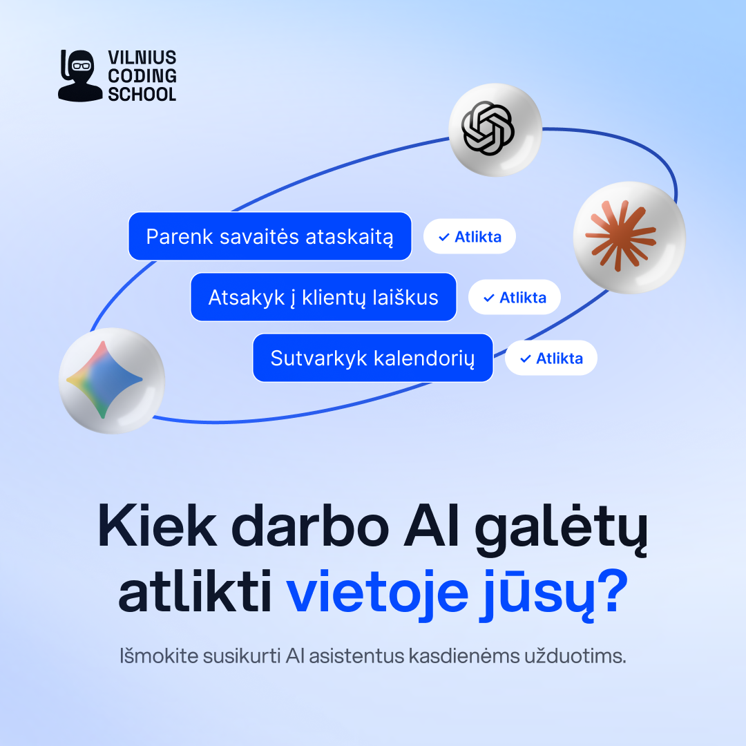
AI assistants and Claude, August 2026
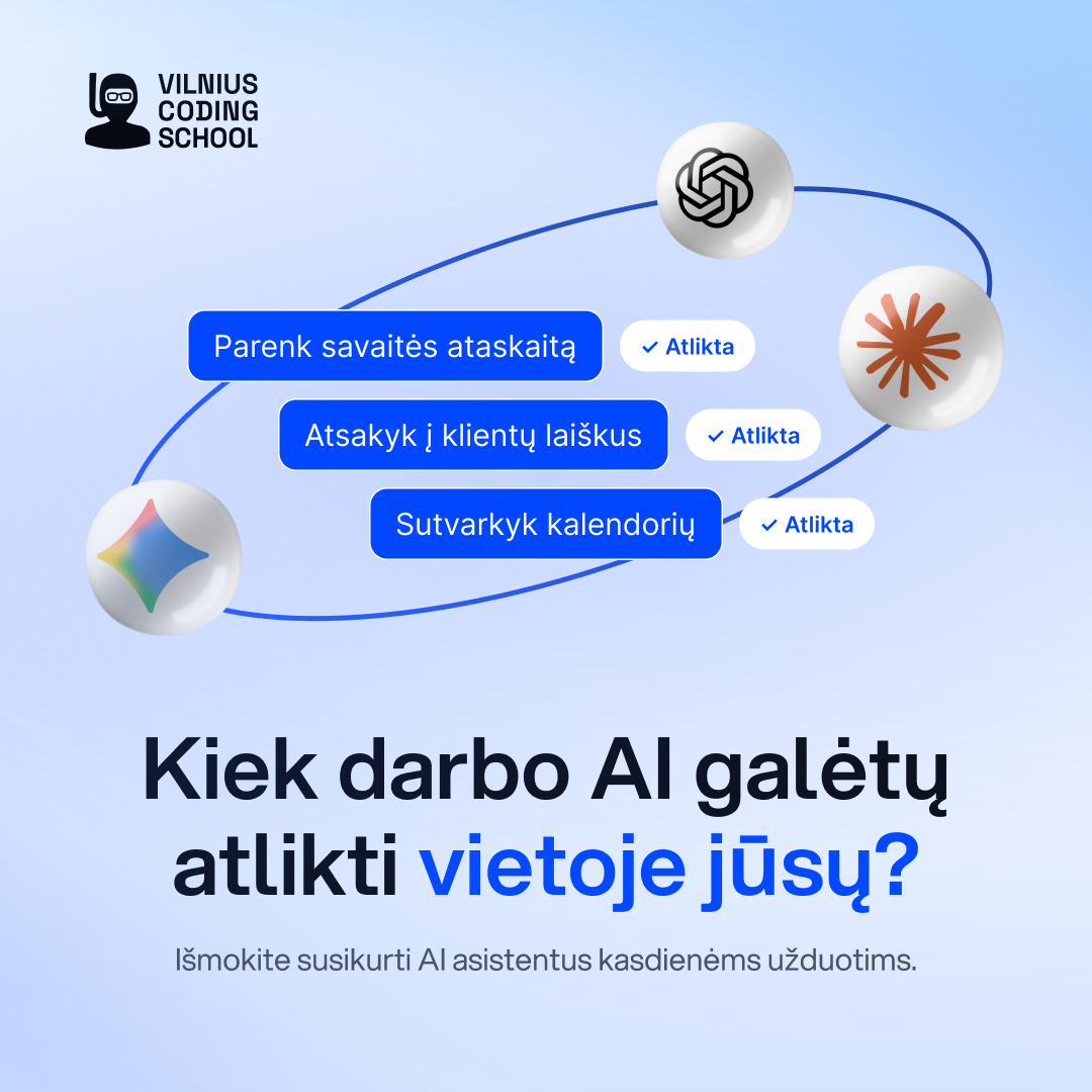
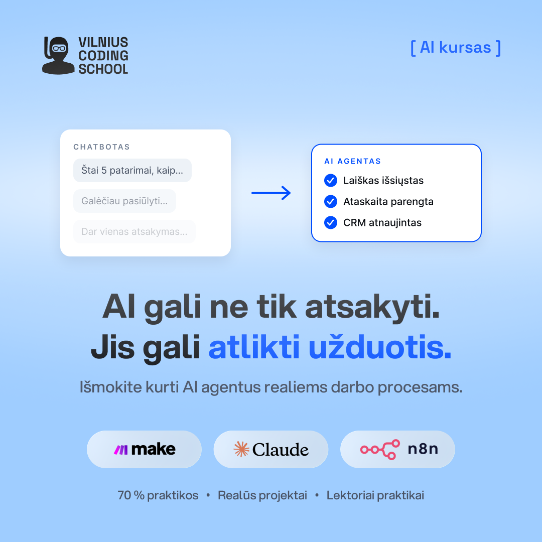
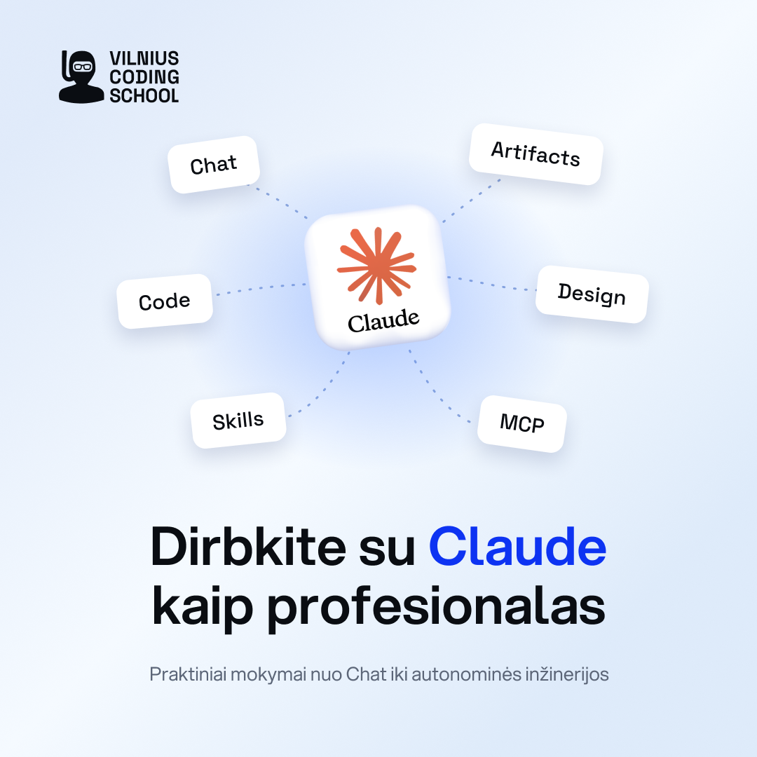
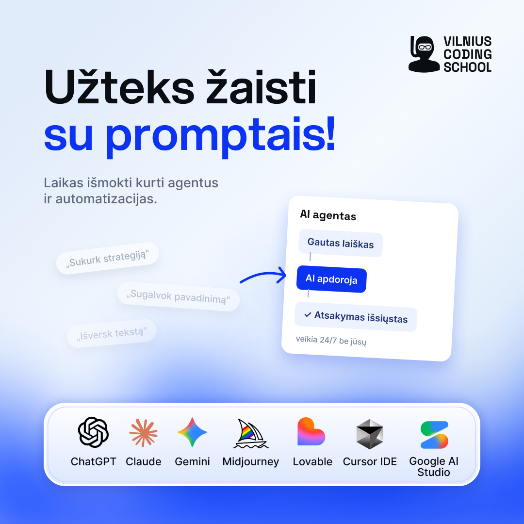
A launch in the most crowded category there is. Instead of “learn AI”, four headlines that are questions or admissions the reader already has: how much of your work AI could do, what lies beyond ChatGPT, working with Claude, and enough playing with prompts. Interface fragments do the explaining, and a logo row is the only proof needed.
The Mentoriai landing page
The landing page behind that campaign was designed and built in code. It has its own page here: open the Mentoriai project ›

Need something like this? Campaign sets, brand identity, landing pages and print, per project or as a monthly design partner.
Three lines are enough: what you sell, what you need, and when. The price is confirmed before anything starts.
Write to me ›What I inherited: every tile shouting something different.
When I joined, the school's ads did what the whole category does: discounts, countdowns, starbursts, gifts, a Santa in December. Each banner carried three or four messages and its own typographic idea, and the blue, green and black palette was applied differently every time. It converted during funding-deadline pushes, but it made the school look like every other bootcamp, and every new asset became a fresh negotiation.
For the first months I kept the pace and the briefs, and used them to learn the audience, the programmes and what the sales team actually needed. In parallel I audited the brand against five competitors, reviewed six months of Meta advertising, and wrote down the tone-of-voice principles the second half of the year would follow.
Nine months, about a thousand assets, and a change of voice you can see.
The situation
A school with a marketing calendar that never stops. The ads did what the whole category does: discounts, countdowns, starbursts, a Santa in December. The look was inherited, and the written guidelines had not caught up with where the school was going.
What changed
I rewrote the foundations the team now works from: positioning, tone of voice and guidelines, plus a full website redesign in Figma that stays internal for now. From May the campaigns followed them: one idea per tile, the question the reader is already asking, one blue. Every campaign still shipped on time.